Book review: Kahneman’s "Thinking, Fast and Slow" From the Perspective of Product Design

Written by Oleg Safranov
Illustration – Milad Fakurian


As product designers, we often find ourselves gravitating toward established patterns, proven heuristics, familiar mental models, and trusted frameworks. These tools offer structure and reliability, guiding us as we craft more intuitive, effective user experiences. When we dive beneath surface-level behaviors and aim to understand users cognitively, that’s where true innovation begins.
Daniel Kahneman’s Thinking, Fast and Slow is one of those exceptional books that, though not written with designers in mind, can completely reshape the way we see users—and even ourselves. Its impact spans multiple disciplines, but its relevance to product design is particularly striking. Let's focus on that, starting with the core idea. Kahneman introduces a dual-system model of human thought. If you’ve heard of the book, you’ve likely heard this part. System 1: fast, automatic, instinctive. System 2: slow, effortful, analytical. They define how we interact with the world—and with products in particular.
Think about it. When a user quickly scrolls through an app or instinctively taps a button, that’s System 1 at play. It’s intuitive, seamless, and requires little thought effort if any. But when a UI forces users to pause, analyze, or recall how something works? System 2 kicks in—and fatigue follows soon after. That’s the crux of Kahneman’s insight: most of the time, our users are operating in System 1. Great design doesn’t fight that—it flows with it. Remember "Don't make me think"?
Though Kahneman’s terms are now part of the mainstream, their essence appears across fields. Marketing, neuroscience, behavioral economics—they’ve all touched this idea. Marketers might talk about the “reptilian brain” or the “survival brain,” drawing from Paul MacLean’s brain theory or Donald Miller’s frameworks. Robert Cialdini, Malcolm Gladwell, and others echo similar themes, reinforcing just how deeply System 1 thinking drives behavior.
From my time as a Creative Director working closely with marketing teams, I’ve seen firsthand how revered this book is in that world. It’s practically a foundational text for understanding consumer psychology. But this article offers a different take—a designer’s take. One focused not on persuasion (let's leave it to marketers), but on clarity, empathy, and usability. Where marketers use these insights to influence choices, designers can use them to enhance experiences.
Of course, we all know Norman’s heuristics. Daniel Kahneman defines heuristics as shortcuts people use to make decisions. These shortcuts are employed when people face complex problems that are difficult to fully understand, and we can expand on these mental shortcuts in a way that’s deeply useful for design.
Let's skim through main heuristics and concepts from the book:
Peak-end rule: the friction users forget, the feelings they remember
One of Kahneman’s most actionable concepts is the peak-end rule—the idea that people judge experiences by their emotional highs and how they end, not by the sum of every moment. This is gold for product teams. A delightful onboarding, a rewarding moment after task completion, or even a clean, calming checkout flow can leave a lasting impression. The friction users forget, the feelings they remember. (Read my article It’s "It's All About Delight" if this resonates.)
A famous example from the book is the cold water experiment, where participants submerged their hand in painfully cold water twice—once for 60 seconds and once for 90 seconds, with the last 30 seconds slightly warmer. Surprisingly, many preferred the longer trial because it ended on a less painful note. In onboarding, users might prefer a slightly longer flow that ends with a clear result and/or success message, friendly animation, or small reward over a faster one that not only looks cumbersome but also ends abruptly. Just like in the cold water experiment, the positive ending shapes their memory of the entire experience—showcasing the peak-end rule in action.
Cognitive ease: if something feels easy to understand, it feels true
Cognitive ease is another powerful concept. If something feels easy to understand, it feels good. It feels true. It builds trust. Clean, legible UIs and consistent UI patterns aren’t just nice to have—they’re neurologically reassuring. Add the exposure effect (familiarity breeds comfort), and the case for consistency becomes even stronger. This is the psychological backbone of every great design system, right? There is nothing to explain more.
Anchoring: anchor, then sell
Cognitive biases shape how users perceive, interpret, and interact with digital products—often in ways that are invisible but powerful. One of the most well-documented is anchoring bias, where people’s judgments are disproportionately influenced by the first piece of information they encounter. In UX design, this often plays out in pricing strategies. For example, when a $99/month premium plan is shown first, it sets an anchor that makes a $49/month plan seem more affordable—even if it’s more than users originally planned to spend. That initial price becomes a mental benchmark, subtly guiding their sense of value and influencing decision-making. This also works for tiers and different forms of subscriptions: anchor, then sell.
Hindsight and confirmation biases: I knew it wouldn’t work
Hindsight bias is the tendency to believe, after an outcome has occurred, that it was obvious or predictable all along. You’ve likely experienced it when you kick yourself for not buying a stock right before it soared—or for holding onto one just before it dropped. In product development, this often shows up during retrospectives—when a feature fails and team members claim they “knew it wouldn’t work.” This illusion of foresight can discourage open discussion, learning, and experimentation. Similarly, confirmation bias leads people to seek out information that supports what they already believe while ignoring evidence to the contrary. A product team convinced that their onboarding flow is effective may focus only on positive user comments, while overlooking data that shows high drop-off rates. These biases not only skew judgment but can also limit a team’s ability to respond objectively to user behavior. Recognizing them is the first step toward designing with greater clarity—and decision-making grounded in evidence, not intuition alone.
Prospect Theory and loss aversion: people fear loss more than they value gain
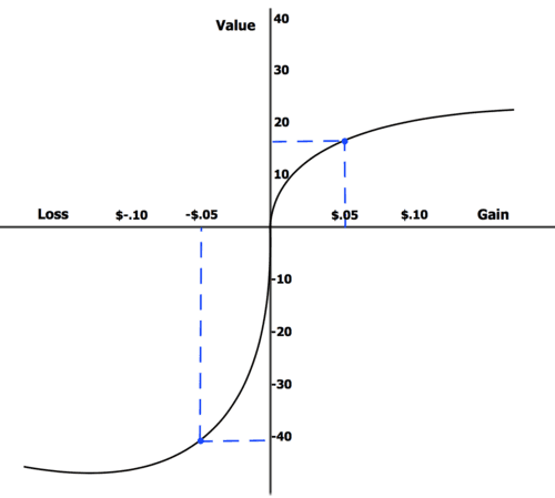
Then there’s Prospect Theory, a cornerstone of the book. Its insight: people fear loss more than they value gain. This explains user resistance to removing features, canceling subscriptions, or giving up progress. Designers must tread carefully here. Saying “Don’t lose your data” activates a much stronger response than “Keep your data safe”—even if both say the same thing.
Look at the graph—it illustrates Prospect Theory, which explains how people perceive gains and losses differently. The horizontal axis shows monetary change, while the vertical axis represents perceived value or emotional impact. The key insight is that losses feel more painful than gains feel pleasurable—losing a small amount, like $0.05, has a much stronger negative emotional impact than the positive feeling of gaining the same amount. This is shown by the steeper curve on the loss side of the graph, highlighting a concept known as loss aversion. In practical terms, this means people are more motivated to avoid losses than to achieve equivalent gains, a principle that can be powerful in design, marketing, and communication strategies. We, designers, should be aware that framing something as a potential loss can be more persuasive than framing it as a gain.
Endowment effect: people place extra value on what they already have
Another concept—the endowment effect—shows how people place extra value on what they already have. That’s why users get upset when interfaces change or features disappear, even if they never used them. It’s why redesigns are often met with resistance. It’s a natural part of human psychology—and one that aligns with the “Four Forces” model in the JTBD framework, where the pull of the new must overcome the inertia of the current.
Mental accounting: reframe spendings
Mental accounting is yet another behavior designers must factor in. People treat money differently depending on how it’s framed. A $60 one-time purchase feels bigger than $5/month—even though they’re identical over time. Or consider AI tools: users are more comfortable spending “credits” or “tokens” than real dollars. The labels matter. The framing matters. This is about perception as much as pricing.
One extra — planning fallacy
And let’s not forget ourselves, designer, specifically our project management and time/sprint estimation. The planning fallacy—underestimating how long things take—is alive and well in every sprint and roadmap. Kahneman’s idea of a premortem—imagining a project has already failed, then asking why—fits beautifully into the design process. It’s proactive. It’s humble. And it’s incredibly useful.
In the end, Thinking, Fast and Slow is more than a psychology book. It’s a mirror. It helps us see the minds behind the mouse clicks. It helps us design not for idealized users, but for real people—flawed, biased people. And that, more than any tool or trend, is what makes great design possible.
Because design is never just about how things look. It’s about how they feel. You name it.